How many meetings have you been in this year with no actionable outcome? How many uninspiring presentations have you sat through where valuable insights have been lost between awkward PowerPoint transitions and busy graphics that fail to capture the audience’s attention? Data is only valuable when it drives decision and action, and the key to doing so is through storytelling.
Start with the End
When it comes to data storytelling, it's crucial to begin with a clear understanding of the end goal. What do you want your audience to do with the information you present? This is not just about showing data but guiding your audience toward a specific action or decision. Every aspect of your presentation should be aligned with this objective.
The power of visualisation plays a critical role here. Historically, well-crafted data visualisations have changed minds and shaped societies. Take, for instance, Dr. John Snow’s map of cholera outbreaks in London in 1854. By plotting the deaths around the Broad Street water pump, he was able to demonstrate that cholera was waterborne, contrary to the prevailing belief that it was spread through the air. This visual evidence led to groundbreaking changes in public health.
Another powerful example is Florence Nightingale’s Rose Diagrams which vividly showed the impact of poor sanitary conditions on soldier mortality during the Crimean War. Her clear and impactful visualisations directly influenced military and hospital practices, saving countless lives.
These examples underscore the importance of starting with the end in mind. When you have a specific goal, your data visualisations become more focused, persuasive, and capable of driving real change. To maintain this focus, you can take advice from Chris Anderson, curator of TED talks, and use a "throughline" — a single sentence that captures the essence of your presentation. Everything you present should connect back to this core message, ensuring your narrative is cohesive and directed toward a clear outcome.
Focus Attention
The human brain is wired to process visual information quickly and efficiently. Research shows that we can recognise images in as little as 13 milliseconds. This rapid processing means that visuals are incredibly powerful tools for capturing and directing attention.
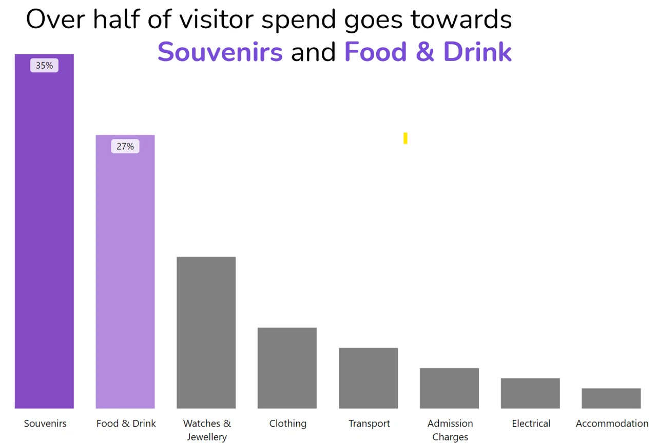
Our brains are constantly filtering vast amounts of visual information, focusing only on what's most relevant. As humans, we are excellent at finding patterns and picking out exceptions to those patterns. Attributes like colour, size, and shape stand out instantly, without conscious thought. By strategically using these attributes in your data presentations, you can guide your audience's focus to the most important elements.
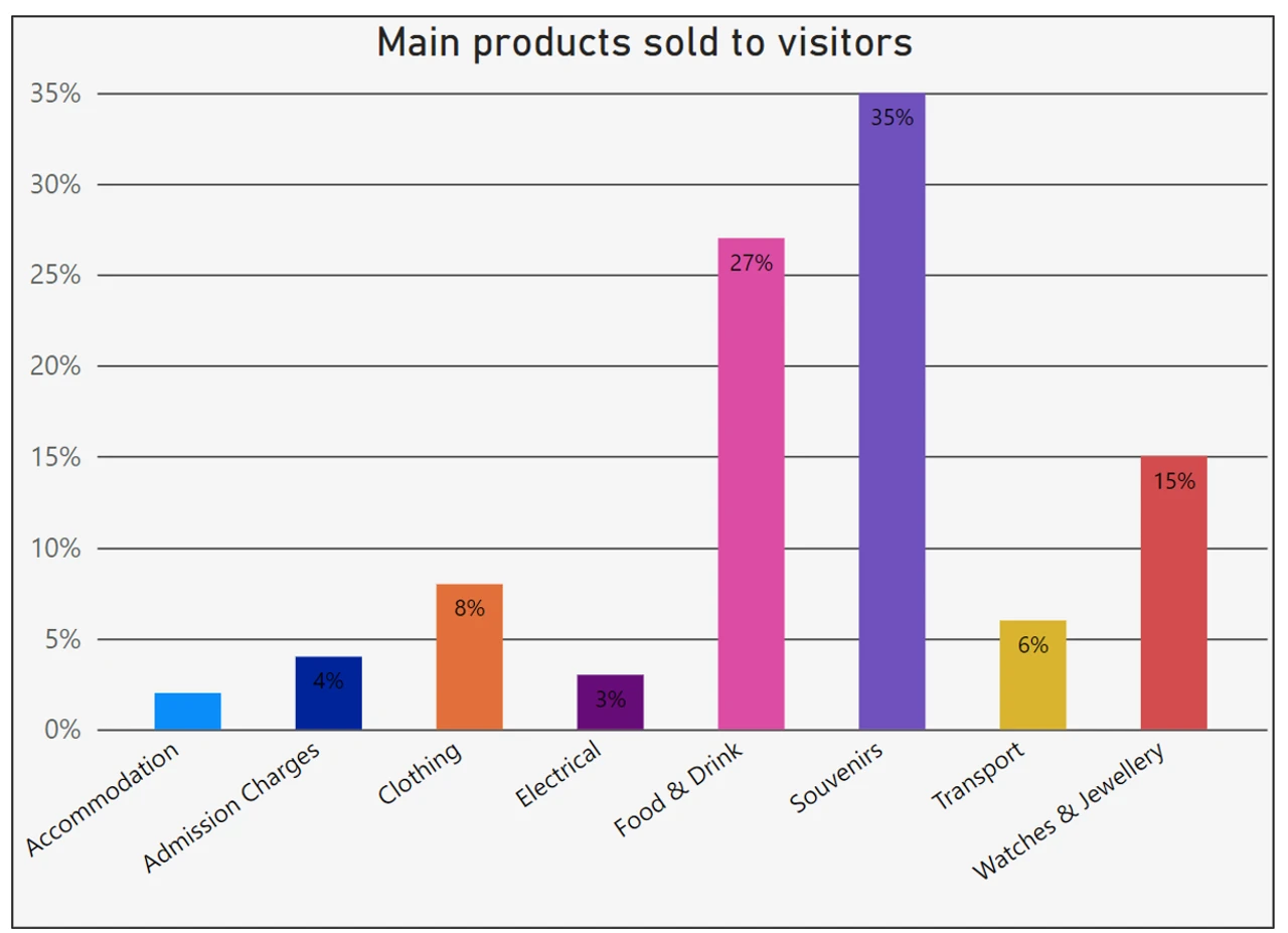
Avoid overwhelming your audience with complex or cluttered visuals and allow the reader to come to your desired conclusion with as little work needed from them as possible. Choosing the right visual format is key. Different types of data are best represented by different kinds of charts and graphs. Choose the one that best fits your message. For example, showing data over time such as sales performance over time compared to a target goal would be best shown in a line graph but comparing the popularity of two different products would be easiest to understand as a bar chart.
Adopt a "less is more" approach. Simplify your charts, remove unnecessary elements, and focus on what truly matters. This "remove to improve" mindset helps reduce cognitive load, making it easier for your audience to absorb and act on your insights.
Tell A Story
Numbers and charts alone rarely inspire action. However, when data is woven into a narrative, it becomes memorable and impactful. Humans are natural storytellers, and stories have a unique power to evoke emotions, create connections, and make complex information relatable.
Consider the timeless tale of Cinderella. Imagine if it were presented as a series of bullet points in a PowerPoint presentation. The magic and emotional resonance would be lost, and the story would be forgettable. However, told as a narrative, with a clear beginning, middle, and end, it becomes engaging and memorable. This is the power of storytelling.
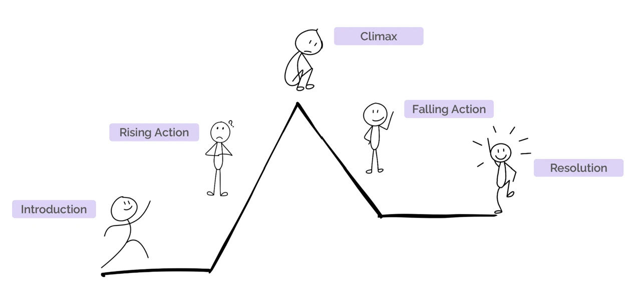
To effectively tell a story with data, structure your presentation like a narrative arc:
-
Introduction: Set the scene and provide context. Explain why the data or insight is relevant and important to your audience.
-
Rising Action: Introduce the conflict or problem that the data reveals. This builds tension and keeps your audience engaged.
-
Climax: Present the peak of your data story, the key insight or revelation that highlights the urgency or opportunity at hand.
-
Falling Action: Suggest potential solutions or actions based on the data. This provides a roadmap for your audience to follow.
-
Resolution: Conclude by empowering your audience to take action. Position them as the heroes who can implement the change or decision needed to achieve the desired outcome.